New Welcome Experience.
Recreated Playtime’s onboarding into a 2-step, value-first flow — clarifying rewards and boosting trust — which lifted new user conversion by 19–40% and revenue by 9–17% across markets.
B2B · Mobile · New user conversion
Conversion
+19-40%
Revenue
+9-17%
1.
Discover
Context & Background
Product: Playtime (B2B2C mobile)
Role: Product Designer (sole designer on Playtime)
Team: PM, Engineers, BI Analyst, Marketing, Legal Team
Business Goal: Increase new user conversion rate and optimize revenue with user-goal oriented narrative.
The Challenge
Prior onboarding was cluttered and text heavy → many users ended up not accepting even terms of service.
Lack of clarity around “what's in for them”, and imperfect look reduced user trust.
Low conversion rate, around 40% among all new users.
Research & Insights
60% of users abandoned at the very first Terms & Conditions (ToC) screen.
52% of Android users declined tracking permissions, leading to fewer high-value offers and reduced rewards.
Users who did not accept tracking created 42% more support tickets, as their rewards were delayed and progress was harder to confirm.
Success Criteria
Improve new user conversion.
Increase new user revenue.
Create a flexible welcome page system for customization depending on placement, view area, and publisher demands.
2.
Define
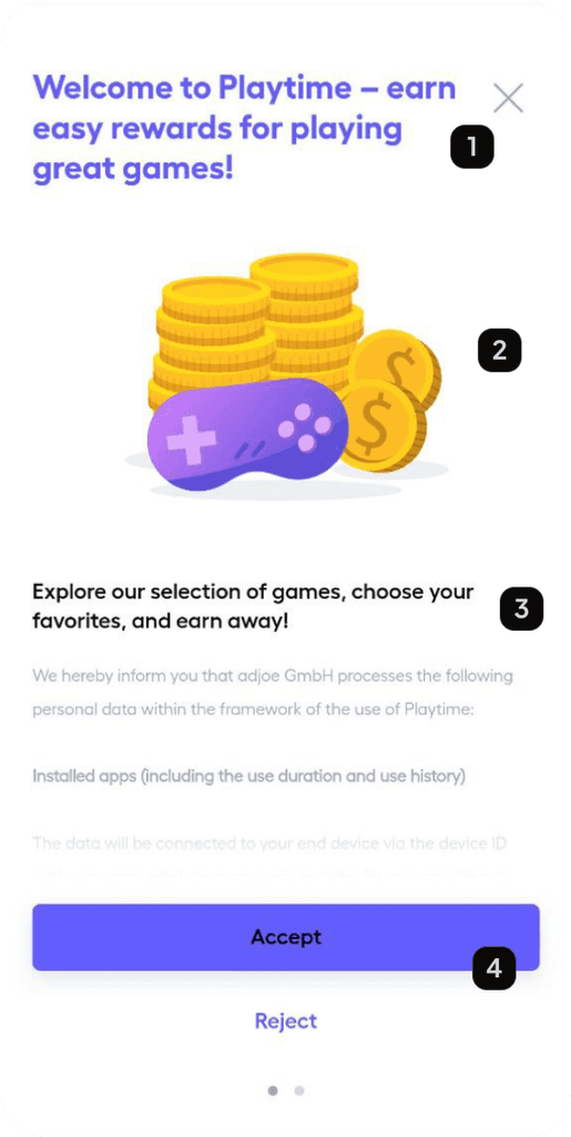
Long title with out dated UI element decreases reputation
Low quality and static illustrations are not appealing enough to excite users
Long, small, and hard to read text creates trust issues
Accessibility issues on the primary button
Problems on the page
Problem Framing
Onboarding was creating friction at the earliest touchpoint, undermining trust before users saw value.
Tracking permission screens have fewer problems but users drop already before it on the Terms and Conditions page, resulting in lower conversion rates.
Publishers struggled with generic, inflexible onboarding flows that didn’t fit their campaigns or brand tone.
Hypothesis
If we highlight what users will gain from Playtime, keep content short, and use delightful and cleaner look, more users will accept ToC and tracking permissions, because they will see the value upfront while feeling reassured that their data is secure and rewards are not scam.
3.
Develop
🏞️
wireframes for different layouts
Old game details page
Design Exploration
Explored multiple layout variations, benchmarking against reward and fintech apps.
Simple high quality visual + short value-oriented text is the most common and successful.
Why? High quality look ensures trust: aesthetic usability effect.
Short value oriented text: nothing to hide, your data is secure and this is what you will gain from Playtime.
Final 2 alternatives for testing
Iterations
Tested two alternatives:
Lightweight flow with animated visuals
Clarified data security and consent communication
Worked with the legal team to simplify consent language for clarity.
Usability testing showed:
Users preferred short, visual supported, and goal-focused flows.
Publishers wanted a replaceable image area and flexibility to toggle on and off each individual element.
Solved technical constraints: shadows in Lottie animations didn’t render on iOS, requiring redesign.
Final decision: simpler design: Launch with a animated two-step flow, followed by contextual tooltips in future iterations.
Negotiated with engineers to simplify edge cases while ensuring animations worked smoothly across platforms.
4.
Deliver
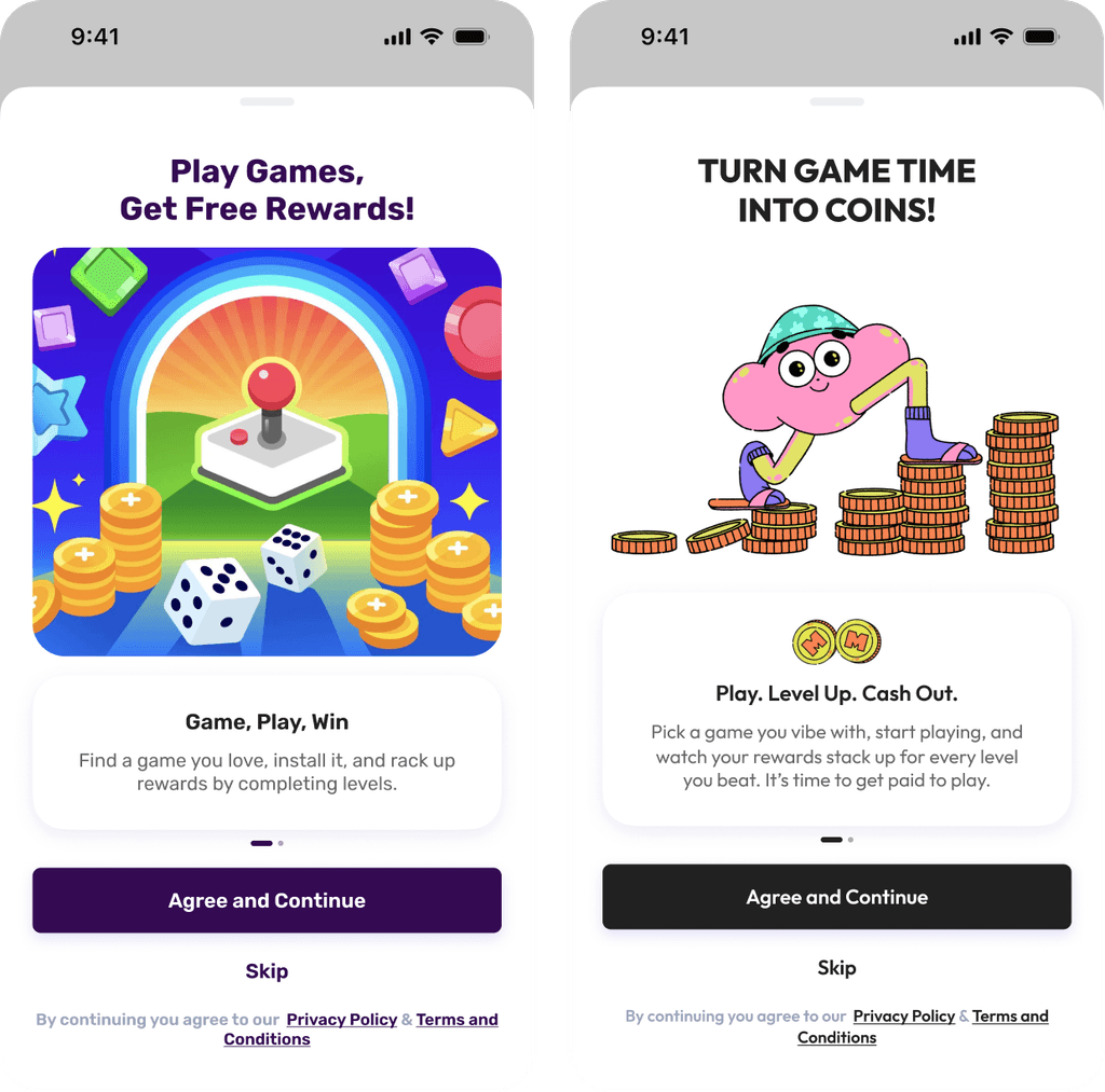
New ToC Screens as customized by Publishers
Final Solution
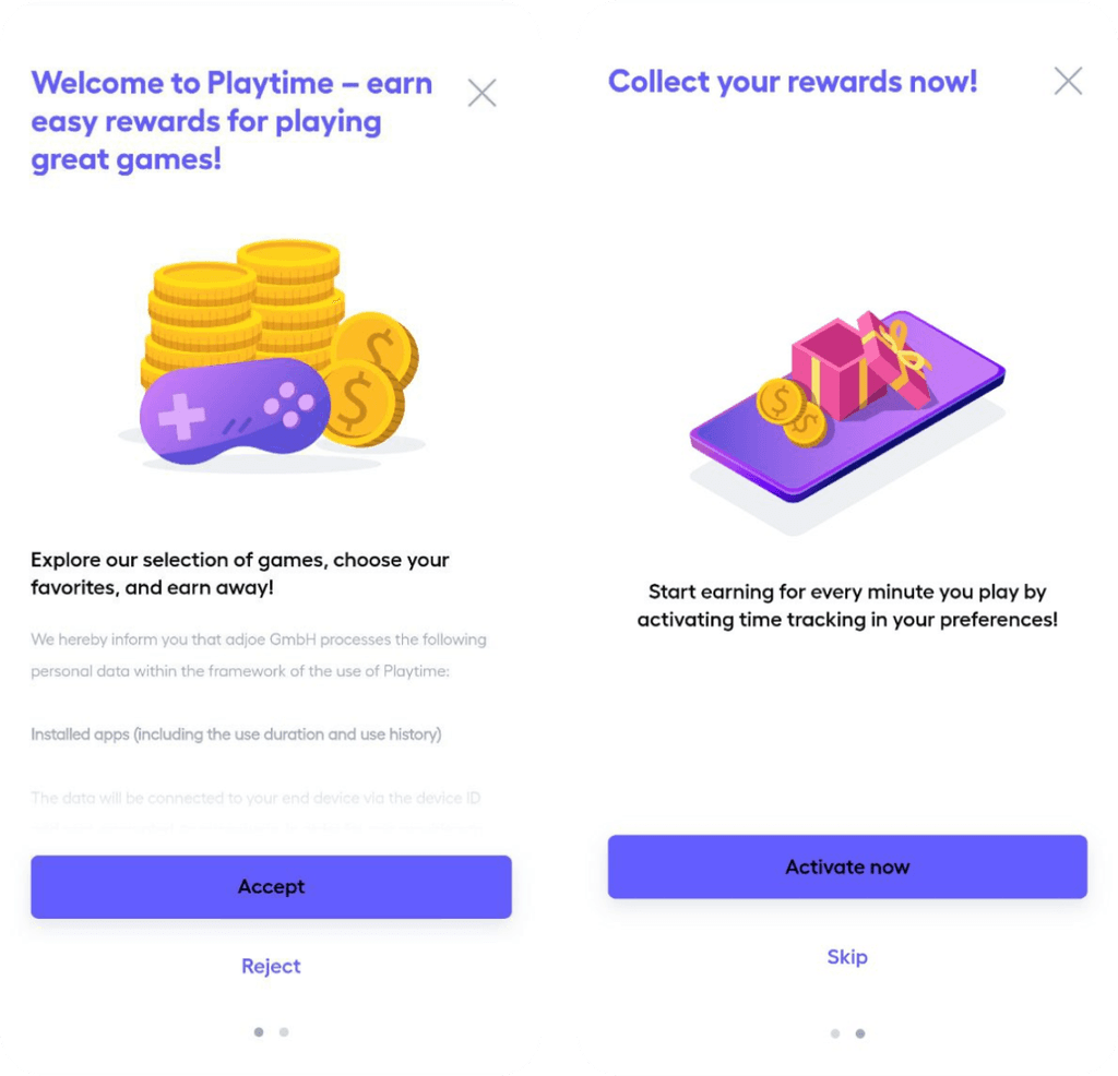
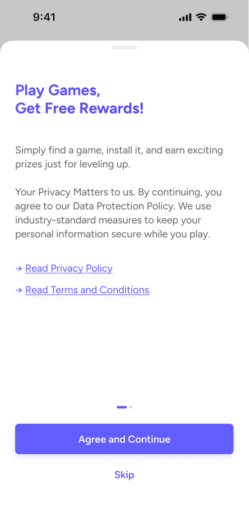
Two-step onboarding flow:
ToC screen reframed with a value proposition (“earn coins by playing games”).
Tracking permissions screen reframed with reasons and reassurances (better offers, secure data).
Designed a content management system, enabling publishers to customize text and visuals easily without design/dev resources.
Old vs. new design
Impact
+19–40%
increase in user conversion
+9-17%
revenue uplift per publisher
🧩
Flexible system allowed publishers to customize welcome screens, ensure brand trust.
🤝
More publisher agreements, thanks to easier customization and improved onboarding outcomes
Reflection & Learnings
Nail the first impression. It is essential to build trust and highlight value for new users to create conversion.
Customization is essential. Welcoming must act as a white-label solution.
Check platform issues. New file types can have platform specific constraints, ensure new solution works seamless on everywhere.
Future Opportunities
Lottie library for customization
Lottie animation is for default option. Publishers can replace animation with static images for now. Enabling lottie file selection with color customizations can leverage the end-user experience and interactivity.
Live preview during customization
Extend CMS into a customization center with live preview, empowering publishers with full control.
Active onboarding for a quick reward
Introduce a linear active onboarding flow inside the app to guide users until they earn their first reward within minutes, reinforcing early trust and engagement.