Game Details Page Redesign.
Redesigned Playtime’s offer details page into a clearer, goal-oriented layout that highlights rewards and tasks upfront — improving click-to-install by 8%, revenue by 6%, and giving publishers a more flexible, scalable template.
B2B · Mobile · Customizable
Click to install
+8%
Revenue
+6%
1.
Discover
Context & Background
Product: Playtime (B2C mobile, with dashboard management system)
Role: Product Designer (sole designer on Playtime)
Team: PM, Engineers, BI Analyst, Marketing
Business Goal: Increase click-to-install rate and optimize revenue by clarifying the Offer Details Page.
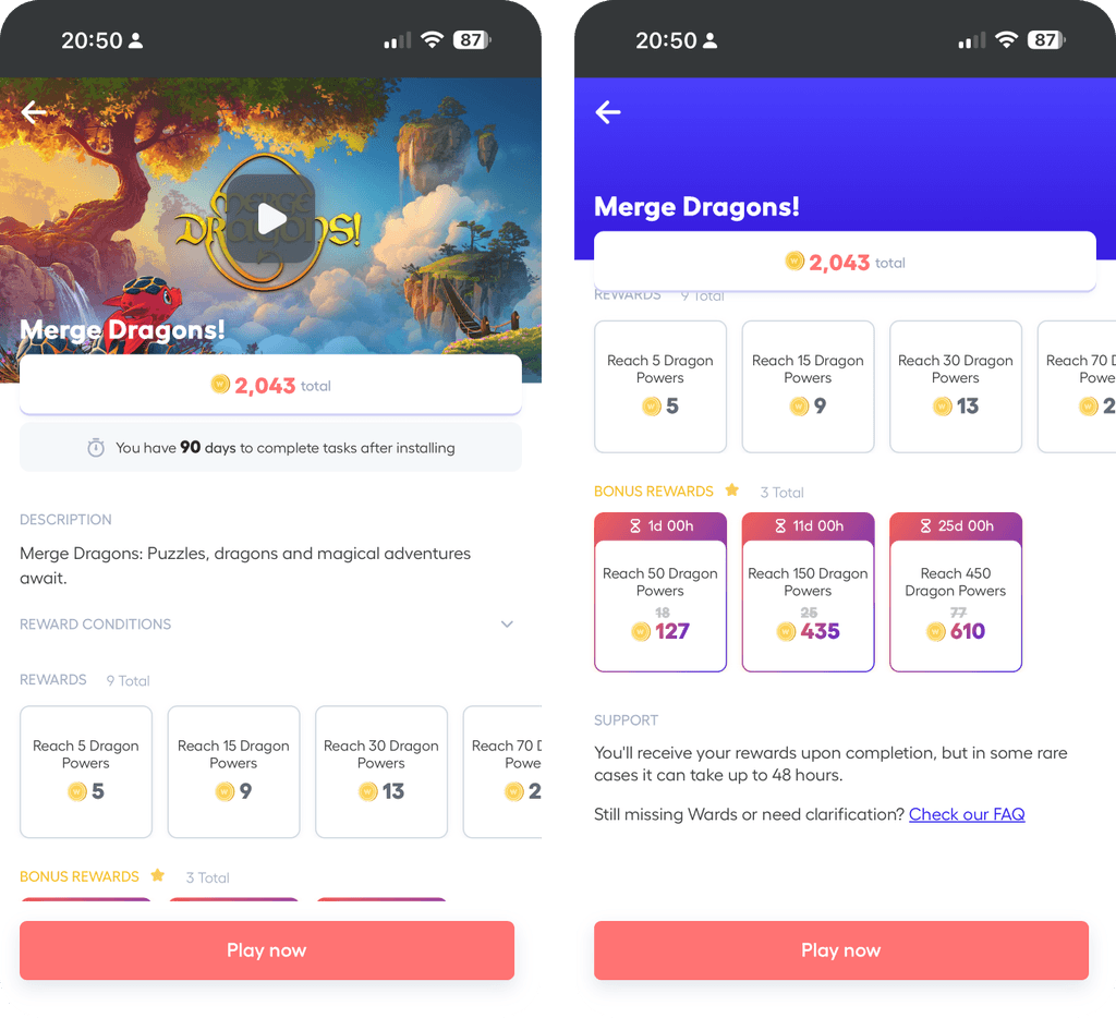
Old game details page
The Challenge
The old design was cluttered, text-heavy, and inconsistent.
Key user goals (understanding reward tasks and game details) were buried, leading to friction in decision-making.
Lack of hierarchy → users couldn’t quickly see what they’d gain or what was required.
2.
Define
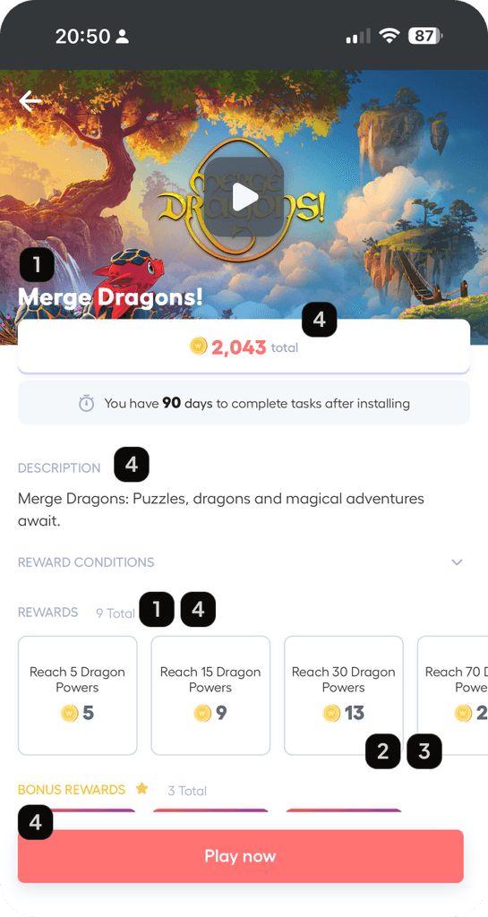
Hard to read content; lack of contrast, hierarchy, and typeface quality
Unscalable reward cards; cut descriptions and challenging for new task types.
Unclear goal for user: rewards are not clear and prominent enough
Multiple UI issues
Old game details page problems
Problem Framing
Users hesitated to click “Install” because rewards and requirements weren’t clear.
User interviews showed most of users values rewards and task rather than game details.
The page structure didn’t scale well for different reward types.
Cluttered UI creates a bad impression also for the game, other than the Playtime.
Success Criteria
Improve click-to-install rate.
Increase revenue from task completions.
Provide a flexible, scalable layout system for different games and publishers: IAP events, bonus, boosters, and future potentials…
3.
Develop
Different content layouts
Design Exploration
Built wireframes and flows to test user journeys for both first-time and repeat visitors.
Benchmarked against industry patterns (fintech, gaming, rewards apps).
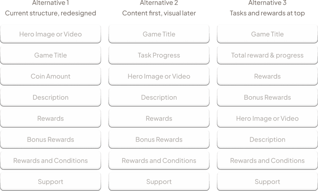
Created 10+ design alternatives covering different information hierarchies:
Tasks prioritized vs. Game Details prioritized.
Visual-first (hero image) vs. summary-first (rewards upfront).
3 of multiple UI trials
Iterations
Narrowed down to 4 core prototypes for A/B testing:
Tasks-first layout
Game Details-first layout
Creatives-first (visual hero)
Summary → Tasks → Details (non-hero, lean hierarchy)
Conducted usability reviews and publisher feedback sessions:
Users wanted rewards and tasks visible above the fold.
Publishers cared about flexibility in where details appeared.
Solved technical constraints (e.g., scroll behavior, text length, reward card expansion).
4.
Deliver
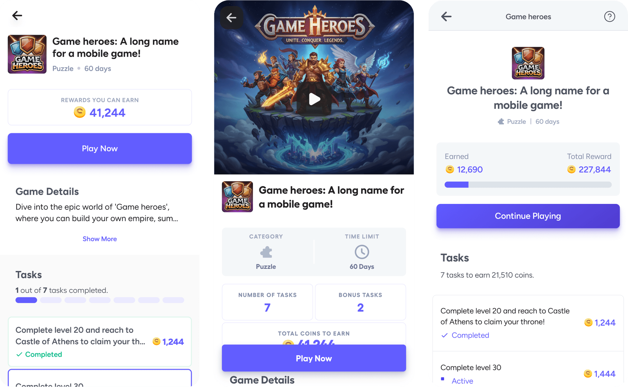
Final version, before and after game is installed
Final Solution
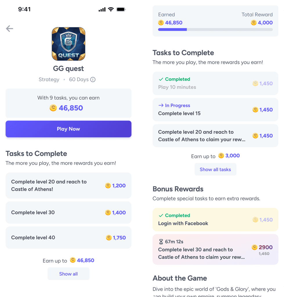
Implemented the “Non-hero, Summary → Tasks → Details” layout:
Summary card (reward potential + CTA) at the top.
Tasks section prioritized above game details for clarity.
Game Details & Reward Conditions simplified and moved lower in hierarchy.
Created componentized UI system (cards, text styles, containers) for consistency and easier scaling.
Old vs New design
Impact
+8%
increase in click-to-install rate
+6%
revenue uplift
🧩
Flexible design system allowed publishers to experiment with different task types.
💎
Scalable card system reduced future design overhead for similar iterations.
Reflection & Learnings
User priority matters. Unlike store pages that start with game descriptions, users prefer seeing rewards and tasks first.
Testing multiple alternatives gave us confidence in the winning solution while providing backup directions for future optimizations.
Component-driven design created efficiency for design & dev handoffs.
Future Opportunities
Adaptive layout personalization
Use behavioral and contextual signals to surface time-limited events or IAPs dynamically, aligning the interface with each user’s current motivation and maximizing conversion potential.
Early success reinforcement
Introduce an easier initial challenge and fast feedback loop to trigger early wins; building user confidence, habit formation, and long-term engagement.
Micro-interactions for cognitive closure
Consistent success motions and transitional cues reinforce progress, reduce uncertainty, and enhance emotional trust; creating a more intuitive and rewarding product experience.